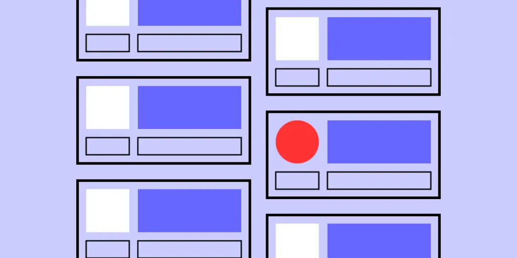
A user interface that looks perfectly balanced in English can develop unexpected layout problems when Japanese content is introduced. Buttons may become crowded, headings can wrap differently, navigation elements may lose their spacing, and form labels can become difficult to read. These problems are not necessarily caused by poor translation. They often result from designing an interface around the assumptions of a single language.
Japanese uses a combination of kanji, hiragana, and katakana, along with its own punctuation, typography, spacing, and text-composition conventions. As a result, translated content needs to be considered during both the localization and design process.
Professional japanese translation services can help businesses prepare accurate and consistent Japanese UI content while maintaining the intended meaning, terminology, and tone. However, translation alone is not enough. Designers, developers, translators, and QA teams need to work together to ensure that the final Japanese interface functions correctly across different devices and screen sizes.
Understand the UI Before Translation Begins
One of the most important steps in Japanese localization is understanding where and how every piece of text will appear.
A short English phrase may be used as a:
- Button label
- Menu item
- Heading
- Form label
- Error message
- Tooltip
- Notification
The same English word can require different Japanese wording depending on its purpose and context. For example, the word “Close” could refer to closing a window, leaving a menu, or stopping an action. Without knowing its function, a translator may select wording that is linguistically correct but unsuitable for the interface.
Providing translators with context before translation begins can significantly reduce these problems.
Provide Screenshots and UI Context
Screenshots are valuable resources for localization teams because they show translators exactly where the text will appear.
A screenshot can help identify:
- The location of the text
- Available space
- Surrounding controls
- Whether the text is a button or label
- How users interact with the element
This information allows translators to select wording that fits the actual interface rather than translating isolated strings without context.
Accurate translation does not automatically mean the text will work well in a specific UI component. Context is therefore an important part of professional localization workflows.
Avoid Fixed-Width UI Components
Fixed-width containers are a common source of localization problems.
A button designed around the exact width of an English word may not provide enough flexibility when Japanese text is inserted. Depending on the translation and font, the content may wrap, become clipped, overlap nearby elements, or disturb the visual balance of the interface.
Flexible components give localized content more room to display correctly. Buttons, cards, navigation elements, and other components should ideally be designed to accommodate different languages instead of depending on one specific English phrase.
Allow Text to Reflow Naturally
Not every interface element should have a fixed height.
Headings, descriptions, error messages, help text, notifications, and form instructions may require different amounts of space after localization. If a component has a rigid height, translated text can become partially hidden or overlap other content.
Allowing text to reflow and components to grow vertically provides greater flexibility. This is especially important for responsive interfaces where available space changes between desktop, tablet, and mobile screens.
Keep Button Labels Short and Clear
Buttons usually have limited space, making them particularly sensitive to localization changes.
Common examples include:
- Save
- Cancel
- Continue
- Submit
- Delete
- Search
- Settings
Japanese button labels should be concise while still communicating the intended action clearly. A translation that is unnecessarily long can create spacing and alignment problems throughout the interface.
Localization teams should review every translated button in its actual design environment. If a label does not fit properly, the solution may involve adjusting the wording, modifying the component, or changing the available space.
Test Navigation Menus Carefully
Navigation bars often contain several items in a limited horizontal area. A small change in text width can affect the entire navigation structure.
Potential issues include:
- Overlapping labels
- Unexpected wrapping
- Uneven spacing
- Hidden text
- Misaligned icons
Japanese localization should therefore be tested directly within the navigation system rather than only in a translation document.
Responsive navigation is particularly important because a layout that works on a large desktop screen may become crowded on smaller displays.
Review Japanese Headings Across Screen Sizes
Headings may wrap at different points after translation. A Japanese heading that looks correct on a desktop display may require a different arrangement on a tablet or mobile device.
Localization teams should test headings across:
- Desktop screens
- Tablets
- Mobile devices
- Different browser widths
The objective is to maintain readability while preventing text from covering other interface elements.
Check Forms and Input Fields
Forms contain many small text components that can easily reveal localization problems.
Typical examples include:
- Name
- Password
- Phone number
- Address
- Country
- City
- Postal code
- Payment details
Each label needs sufficient space, but testing should not stop there. Placeholder text, validation messages, instructions, and other dynamic content also need to be reviewed.
A form that appears perfectly balanced in English may need adjustments after Japanese content is introduced.
Make Error Messages Flexible
Error messages need to communicate information clearly while fitting naturally into the interface.
A useful error message should explain what went wrong, what action the user should take, and whether another attempt is required.
Because translated messages may occupy different amounts of space, containers should be flexible enough to expand when necessary. Hiding part of an important error message can make the interface confusing and difficult to use.
Test Dialog Boxes and Pop-Ups
Dialog boxes often contain several elements within a relatively small area. A typical dialog may include a title, description, input field, confirmation message, buttons, or warning.
If Japanese text requires additional vertical or horizontal space, the dialog should adapt accordingly. Designs that rely heavily on fixed dimensions can cause content to overlap or disappear.
Flexible dialog components make localization easier and improve usability across languages.
Review Tooltips and Small Interface Elements
Tooltips can be especially challenging because they usually have limited space and may appear close to the edge of a screen.
Japanese tooltip content should be tested to ensure that it remains visible and readable. A tooltip should not extend outside the visible screen or cover controls that the user needs to access.
These small details can have a significant effect on the overall user experience.
Choose Fonts With Japanese Support
Font selection is another critical part of Japanese UI localization.
Japanese content uses kanji, hiragana, and katakana, so the selected font must properly support the required characters. If a character is unavailable, the system may use a fallback font, potentially creating noticeable differences in:
- Font size
- Character weight
- Spacing
- Line height
- Alignment
Teams should therefore test the actual fonts that will be used in the production interface rather than relying only on development environments.
Adjust Line Height for Japanese Text
Typography designed primarily for Latin scripts may not always provide the best visual results for Japanese content.
Insufficient line height can make Japanese text appear crowded, especially in longer descriptions and information-heavy screens.
Careful testing is particularly important for:
- Help pages
- Settings screens
- Forms
- Notifications
- Documentation
- Long descriptions
The final Japanese text should be reviewed at the actual font size and line-height settings used by the product.
Test Japanese and English Text Together
Many modern applications use Japanese and English simultaneously. A product name, brand name, or technical term may remain in English while surrounding instructions appear in Japanese.
Mixed-script interfaces should be tested for:
- Font compatibility
- Baseline alignment
- Spacing
- Character width
- Line breaks
- Overall visual balance
The goal is to make Japanese and English content appear as a coherent part of the same interface.
Follow Japanese Punctuation Conventions
Japanese has punctuation conventions that differ from those commonly used in English.
Examples include:
- 。
- 、
- 「」
- 『』
Localization teams should use appropriate Japanese punctuation consistently throughout the interface. Inconsistent punctuation can make an otherwise professional product appear unfinished or poorly localized.
Avoid Embedding Important Text Inside Images
Text placed directly inside images creates additional localization work.
For example, if an English promotional banner contains text inside the graphic itself, creating a Japanese version may require redesigning the image. It can also make responsive adaptation more difficult.
Whenever possible, interface text should remain separate from graphical assets. This approach makes future localization easier and allows content to adapt more effectively to different screen sizes.
Localize Dates, Numbers, and Other Formats
Japanese localization can also affect structured information.
Teams should review how the interface displays:
- Dates
- Currencies
- Prices
- Measurements
- Addresses
- Phone numbers
- Percentages
These formats should be appropriate for the intended Japanese audience. Developers should avoid treating formatted values as fixed English strings because localization requirements can vary depending on the information being displayed.
Test Japanese Input Methods
Localization testing should cover not only displayed content but also how users enter Japanese text.
Japanese users commonly use an Input Method Editor (IME), which allows phonetic input to be converted into Japanese characters.
Search fields, forms, account fields, and other input components should be tested for:
- Typing
- Character conversion
- Search suggestions
- Autocomplete
- Partial input
- Japanese and English combinations
Testing the complete input process helps identify problems that may not appear when simply viewing translated text.
Give Extra Attention to Mobile Interfaces
Mobile screens provide less space than desktop displays, making localization problems more visible.
A Japanese interface may look correct on a large monitor but become crowded on a smartphone. Responsive testing should therefore cover menus, buttons, forms, dialogs, cards, notifications, settings, and search fields.
The interface should adapt naturally to different screen sizes without hiding important Japanese content.
Build Flexible Components Into the Design System
A strong design system should support multiple languages from the beginning.
Buttons, menus, cards, dialogs, and forms should not depend on the exact width of a particular English phrase. Flexible widths, sufficient padding, adjustable heights, and responsive behavior can reduce localization problems.
Designing for multilingual content from the start is usually more efficient than rebuilding components after localization issues appear.
Give Translators Space and Character Constraints
Some UI elements genuinely have strict space limitations. When this happens, translators should know about the constraint before beginning the work.
Providing information about available space or maximum length allows translators to choose concise wording while preserving the intended meaning.
Restricted components should be identified before translation begins rather than discovered after the translated content has already been inserted into the interface.
Maintain Consistent Japanese Terminology
Consistency is essential for a professional Japanese interface.
If the same feature is given different Japanese names across different screens, users may assume that the terms represent separate functions.
A terminology guide can include:
- Feature names
- Button labels
- Menu items
- Error messages
- Product names
- Technical terminology
- Customer support terms
Using approved terminology throughout the product creates a more predictable and professional user experience.
Test Complete User Journeys
Localization testing should not focus only on individual screens. Teams should test complete user journeys to identify problems that may appear when multiple components work together.
Useful workflows to test include:
- Creating an account
- Logging in
- Searching
- Adding an item
- Completing a form
- Making a payment
- Changing settings
- Submitting a request
Users should be able to complete these processes without encountering broken Japanese text, overlapping elements, or confusing localized controls.
Test Error, Empty, and Dynamic States
Normal screens are only one part of a product. Localization teams should also test states that contain dynamic or unexpected content.
These can include:
- Empty states
- Error states
- Warning messages
- Success messages
- Loading screens
- Confirmation dialogs
- Long usernames
- Long product names
Such states can expose weaknesses in a design because the content may change depending on user actions or system conditions.
Test Both Short and Long Japanese Strings
A component that works with one Japanese translation may not necessarily work with another.
Testing a range of text lengths helps teams identify components that are too restrictive. This is particularly important for reusable components that appear throughout an application.
Testing different strings before release can prevent unexpected layout failures after new content is introduced.
Consider Accessibility During Japanese Localization
Japanese UI content should remain readable and usable for people with different accessibility needs.
Teams should review:
- Font size
- Line height
- Contrast
- Button spacing
- Text scaling
- Screen-size changes
Important information should remain visible when users increase text size or adjust their viewing environment. Accessibility should therefore be considered alongside translation and visual design rather than treated as a separate final-stage task.
Keep UI Text Separate From Application Code
Where possible, interface text should be stored separately from application logic.
This makes translation management and future updates easier. Developers can update Japanese strings without changing the underlying interface structure, reducing the possibility of accidentally modifying code while editing localized content.
Include Localization Early in Development
Localization should begin during product development instead of being postponed until the interface is completely finished.
Designers and developers should consider Japanese localization when planning:
- Flexible widths
- Flexible heights
- Font support
- Text wrapping
- Japanese input
- Long labels
- Dynamic content
- Responsive layouts
Early planning can reduce the need for expensive redesigns later in the development cycle.
Establish a Japanese Localization Testing Workflow
Japanese UI testing should be included in the release process.
A practical workflow can follow these stages:
- Prepare the interface.
- Identify all UI strings.
- Provide screenshots and context.
- Translate the content.
- Review Japanese wording.
- Insert the approved translations.
- Test the layout.
- Record localization issues.
- Fix affected components.
- Conduct another review.
- Approve the final version.
This process gives translators, designers, developers, and QA teams clear responsibilities throughout localization.
Keep Designers and Translators Connected
Translation and design teams should communicate throughout the localization project.
If a Japanese button does not fit, there may be several possible solutions. The translator could shorten the wording, the designer could increase the button width, or the developer could modify the component.
The right solution depends on the interface and user experience. Collaboration allows the team to select the solution that preserves both language quality and design integrity.
Review Japanese Content After Every Product Update
Localization is not a one-time task.
Future software updates may introduce:
- New buttons
- New navigation items
- New notifications
- New forms
- New settings
- New dynamic content
Every new string should be reviewed and tested in Japanese. Including Japanese content in regression testing helps prevent previously solved layout problems from returning after future releases.
Always Test With Real Japanese Translations
Placeholder content can be useful during early development, but final testing should use approved Japanese translations.
Real content reveals issues involving:
- Character density
- Font rendering
- Line breaks
- Spacing
- Button width
- Line height
- Mixed scripts
The final review should take place inside the actual product so that teams can evaluate the complete user experience rather than relying only on translation files.
Choose Professional Japanese Translation Services
A successful Japanese localization project requires more than general language translation. The translation provider should understand how Japanese content works inside websites, software, mobile applications, and other digital interfaces.
When evaluating japanese translation services, consider whether the provider has experience with:
- Software interfaces
- Mobile applications
- Websites
- Buttons
- Navigation menus
- Error messages
- Product terminology
- Technical content
Professional japanese translation services can support the language side of localization while working within the client’s design and development requirements. Context and terminology experience are especially important because short UI strings can have multiple possible meanings depending on their location and function.
Why Japanese UI Localization Requires a Complete Process
Japanese UI localization combines language, typography, design, development, and quality assurance. Japanese writing has specific requirements involving character composition, spacing, line arrangement, typography, and the handling of mixed scripts.
A layout designed around rigid dimensions can create problems when localized content is introduced. Flexible containers, appropriate fonts, text reflow, and sufficient spacing give Japanese content the room it needs to display correctly.
At the same time, japanese translation services are only one part of a successful localization process. Translators need to work closely with designers, developers, and QA professionals to ensure that accurate language is also presented correctly within the product.
Final Thoughts
Japanese localization works best when it is treated as part of product design rather than as a simple translation step. Teams should provide translators with context, screenshots, and terminology guidelines while giving developers enough flexibility to accommodate different text lengths and writing patterns.
Font support, Japanese input, responsive layouts, accessibility, punctuation, structured data, and complete user-flow testing should all be included in the localization process.
Professional japanese translation services can help businesses create accurate and consistent Japanese content, but the strongest results come from collaboration across the entire product team. When Japanese content is considered from the beginning of development, layout problems become easier to identify, testing becomes more predictable, and the final interface can provide a clearer and more natural experience for Japanese users.